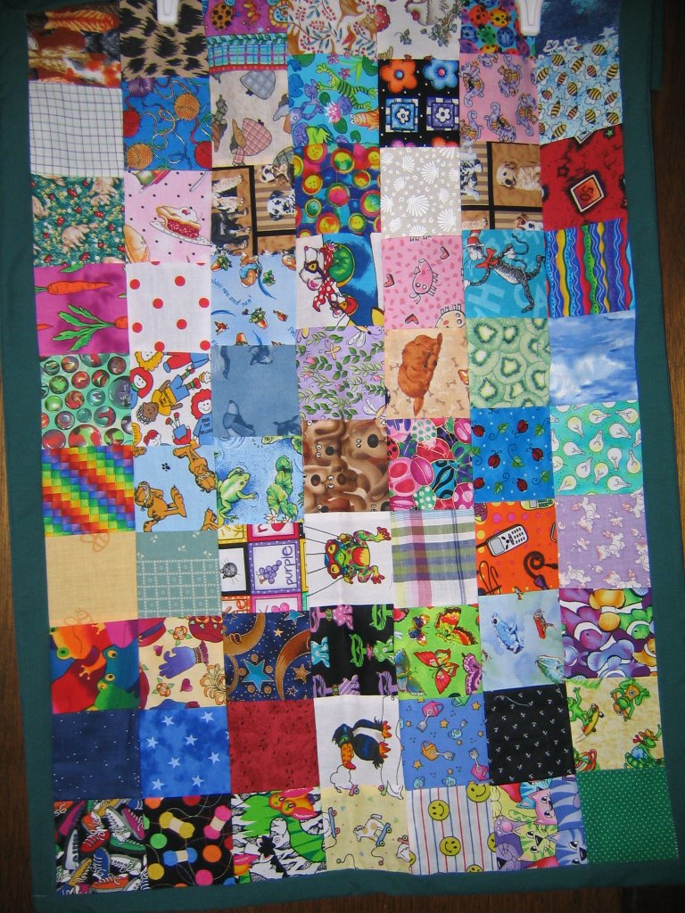
This is a close-up of the simple cat-square lap quilt I did for my GD Tabitha.

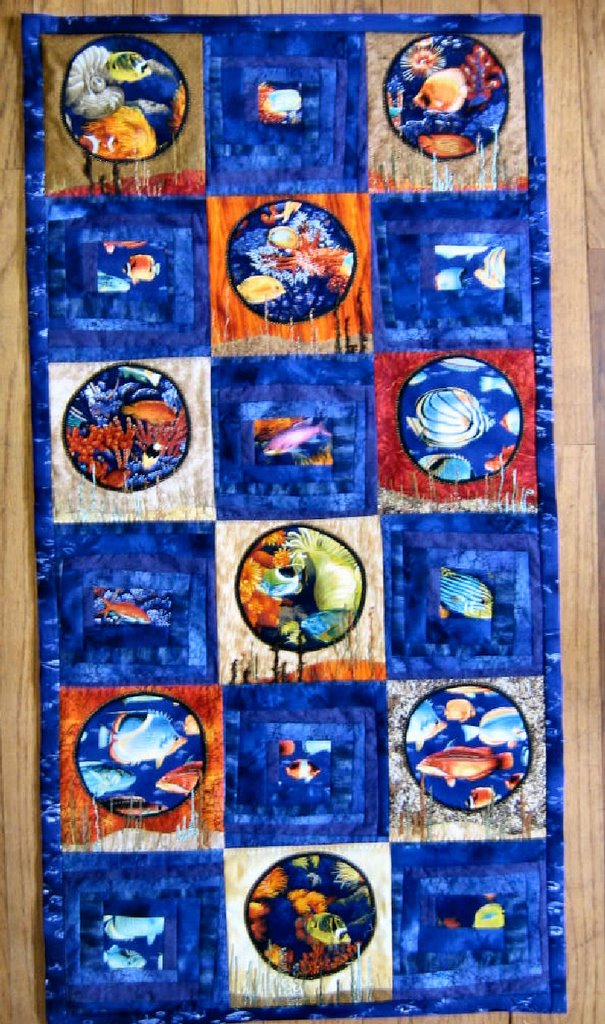 Here is the finished wall hanging. It was and interesting one to work on with color combos that are unusual for me.
  Here is a close up to show more of the detail on the porthole with gold blanket stitch, and the grasses coming up from the bottom are reverse bobbin stitching along with regular free motion stitching.
 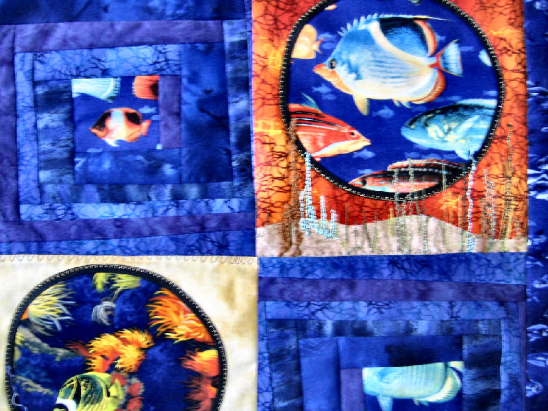 One more shot of a different part to show the beautiful materials.
 It is using my own dyed background material and a whole bunch of fancy stitches from my machine, and some angelina fibers and beads for embellishments.
 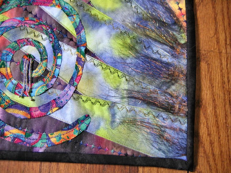 It was fun doing the 'swirls' for a first try. And the angelina stuff is soooooo pretty, that I was delighted to get it attached enough to show it off. I never knew what that fiber was til I read about it here on someone else's blog. She was sorry she couldn't seem to get any more locally. So I went to my favorite shopping mall -EBAY- and now I have five different colors to have fun with.
 Always loved this pattern.
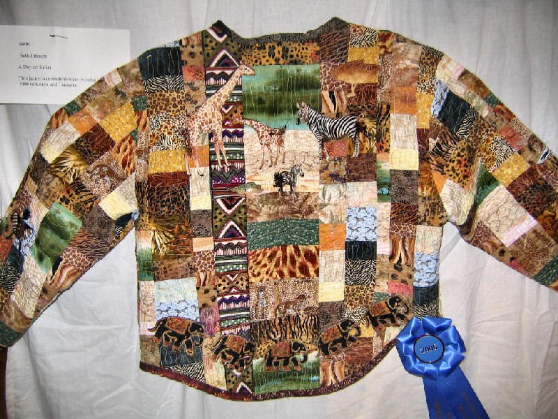 A jacket after my own heart...jungle cats and friends.
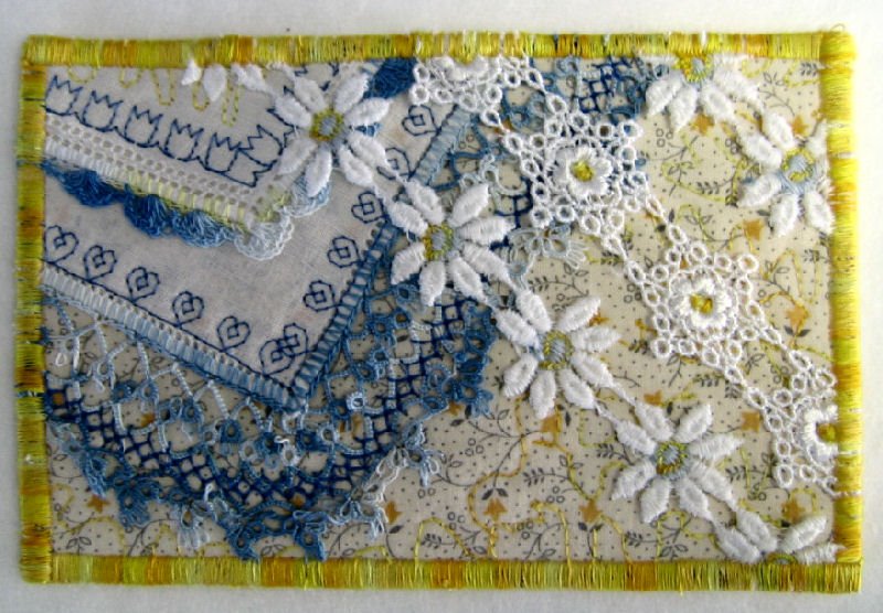 This lacy goody is for a friend who loves victorian.
 And one for a fellow tea-drinker who now lives way up in Stowe, Vt.
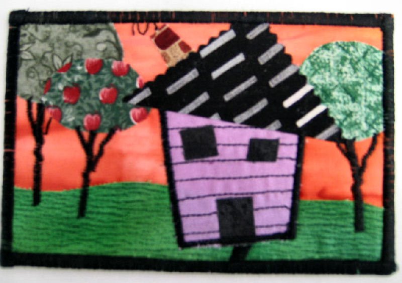 This was a fun project for our real estate agent who has worked extra hard on trying to sell our complicated piece of property and houses. She had a bad time with a bacteria infection and I hope this will brighten her day a bit.
  Used this photo from a Vermont trip to guide the wall quilt below.
 Used beads and stones to embellish and some fusible very gently touched on one edge to make the 'foam' on the water.
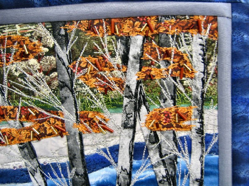 Longer bugle beads enhance the fall leaves
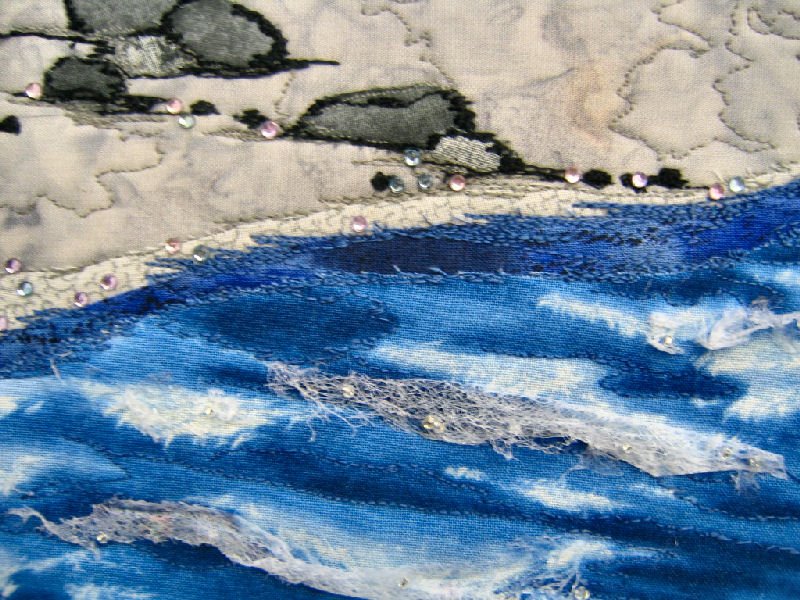 Hope you can see the crystal beads on the foam, here. And, of course there is lots of free motion quilting going on.
 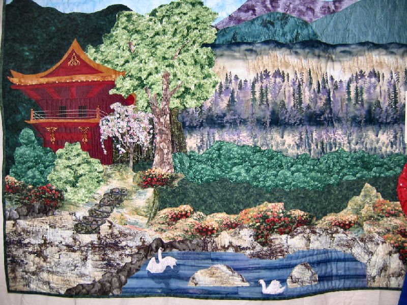 This was really detailed, and made by a group of women. The pink blossoming tree was individual branches with tiny blossoms coming out of the quilt in 3-D
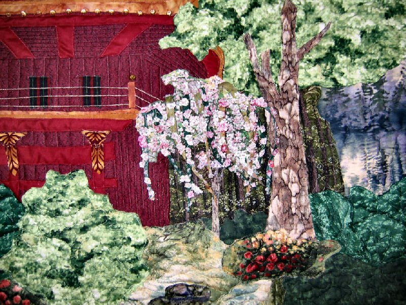 Hope you can see the detail here, but it doesn't compare with the real thing.
  This was a fascinating wall hanging. Certainly fabric art, not a quilt.
 A little bit of everything was in this.
 This was a flannel material so it had a very rich warm color scheme. The pic didn't pick up the warmth of the colors. I have always like this block that looks so three dimensional.
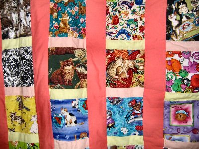
 Another kitty one. It was a simple quilt, but favored my cats theme.
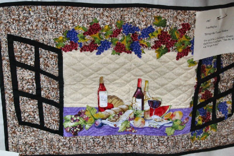 Here we have a Tuscany feel to the scene. Can imagine warm sunshine and soft breezes and a nice glass of wine in the afternoon.
 This was just amazing, in that it is loads of little bits and pieces all sewn down to make the beautiful garden. Of course, there is a kitty, and the lady certainly has earned her peaceful resting spot.
 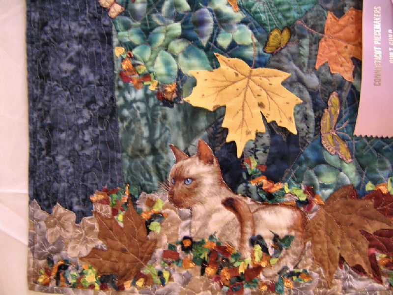 As I favor cats, they are often in the quilts I favor. This is no exception. He looks so comfy here.
 And I do love the ocean- therefore this one is especially appealing. Love the simplicity of line and fresh open feeling. Just like being there.
 I got this idea and inspiration from a quilt made for the alzheimers cause. I added my own touch with shelves, bottles and a plant. The Window also has sheer curtains and the edging is a color that looks like the wall color in the bath.
  This gives you a closer look at the detail.
 This was great fun, as I used a lot more free motion machine quilting than ever before. Just got these great variegated threads that seem a tiny bit thicker than ordinary sewing thread. Show up much better when you 'draw' with them.
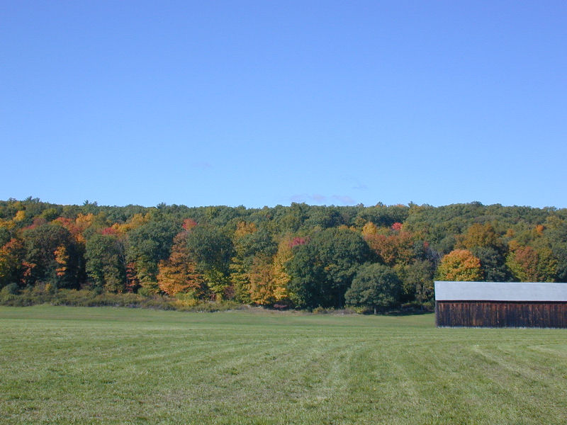
 Here is the pic I used to guide me. We took this going at least 65 mph(probably more...lol) It wasn't convenient to stop on the highway, so I just shot from the open window. Hence the soft blur of all details!
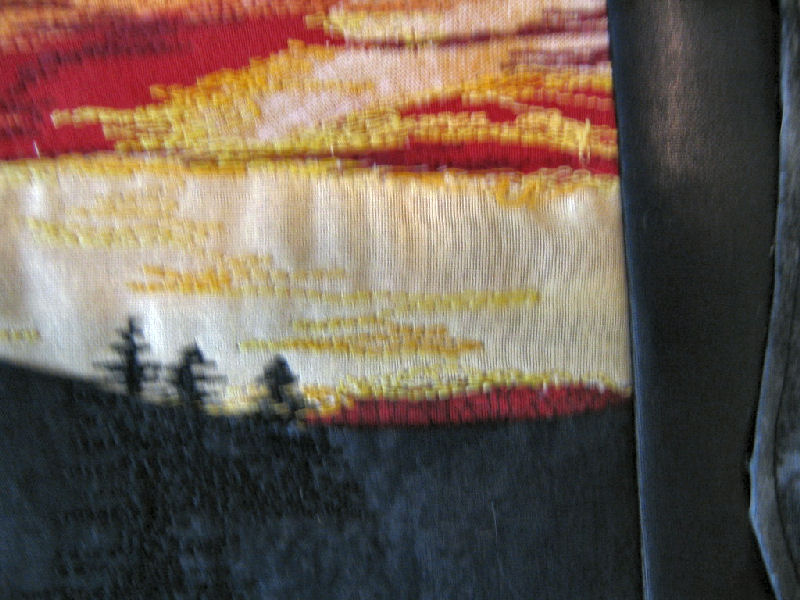 A closer shot of the sky painting, and the tree silouettes. This quilt also incorporates the wavy edging idea. I thought it made a good contrast frame against the reds and oranges and yellow brightness and picks up that small dark cloud coming in at the left.
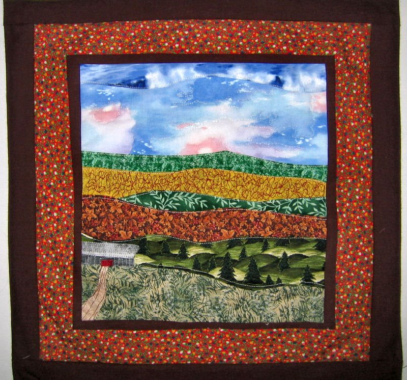
 I found the pic I used as a guide for the last blog entry. I put the barn on the opposite side in the quilt, but I only intended for the picture to be a guide, so it worked out well.
 This one was actually all cut out from our last quilt camp get together. But by now I was improved on the machine quilting and I think this one came out better than my first ones.
 Don't know if it can be seen but this is a closer look at the sewing.
 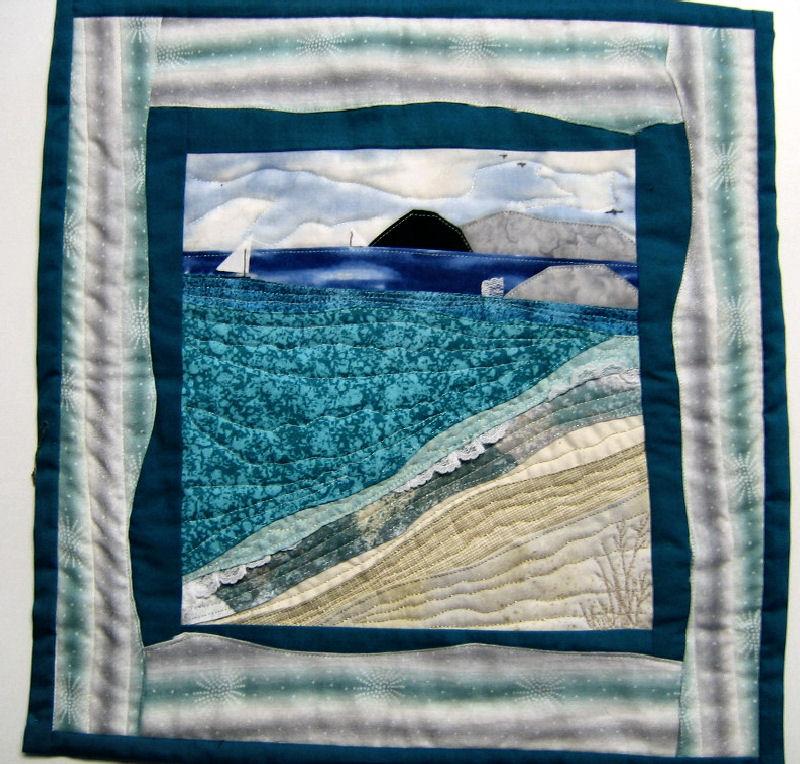 This one uses lace to accent 'waves' which I thought was a very clever idea. All of these use a curvy edge border idea, too. And it was encouraged to make the borders and edging wider and very noticeable, like in art work with a big mat surrounding it that made you want to look closer to the small picture within.
 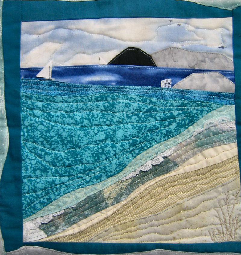 Hopefully you can see the lace poking up as surf and a spurt against the rock.
 ....I managed to find my scenic quilts I had worked on a couple years ago. I had seen them at a quilt show, and bought a pattern for this one, but typically, I still did it in my own way. I did need the directions to get me started in the basics, but I let my imagination take over once I got those directions in place. This dunes scene is my fav' of the ones I did that year, but I want to do even better in the details and aspects of view, now that I have a better sewing machine, and a lot more learning under my belt. I learned how to open up my thinking a great deal in the making of these 25 different postcards. So now it is time to put that new info to work in a field I had only barely touched on a couple years ago.
 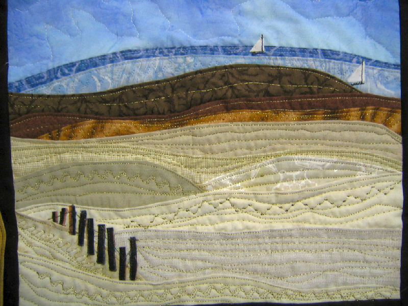 Here you can see a bit closer the machine sewing I was newly learning.
 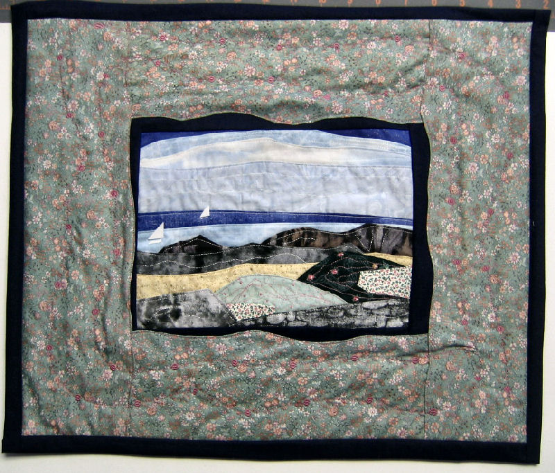 The sailboats are somewhat three dimensional in that there is only the black 'mast' holding it to the quilt. I learned how to do the two-sided material in a class called 'Petal-Play' which taught how to make three dimensional flowers etc. Super idea that I have tacked on to this quilt- and a few others. I didn't particularly like how the quilting came out on this one. I think I can do better..sure hope so.
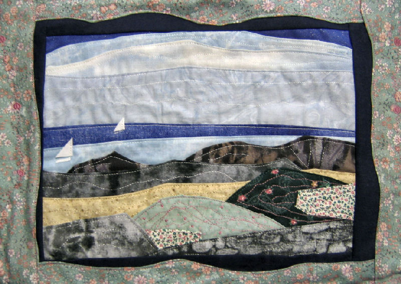 In this close-up you can see what I mean. The shapes are a little more 'blocky' than they should have been.
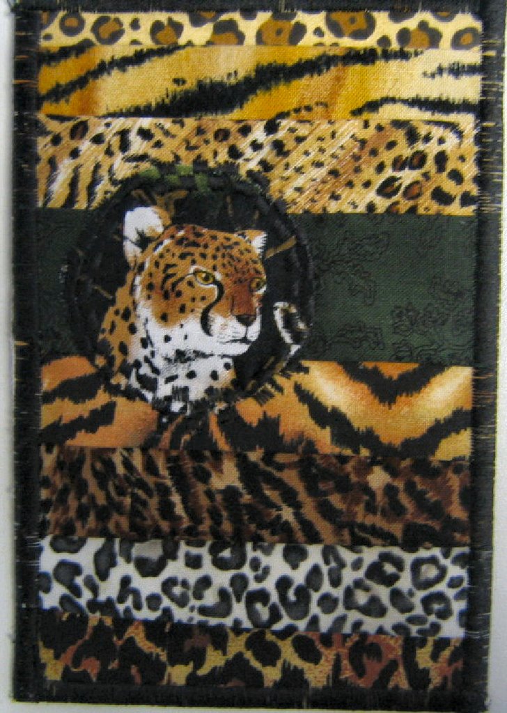 ...with my favorite subject the big cats, and a neat idea I saw on another quilt. Each piece of 'fur' is folded and has an actual edge you can tuck your finger under. The outside edging holds them in place, with the accent cat pic in the middle.
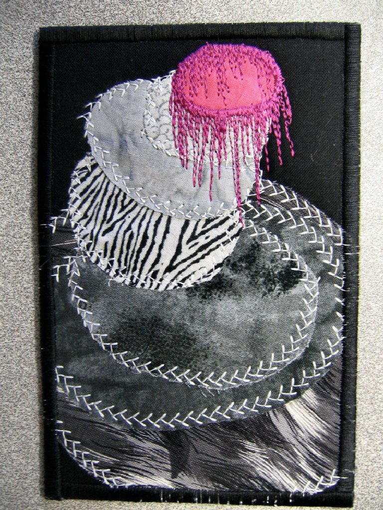
  I loved how this color combo turned out. I think it may be my favorite of the whole 25 cards. I did an extra edging with a fancy stitch, and it looks good on the back as well as the front.
  This last one is "Victorian" inspired. Deep greens, pinks, and burgandy with that gold sparkle touch - great color combo in my book.

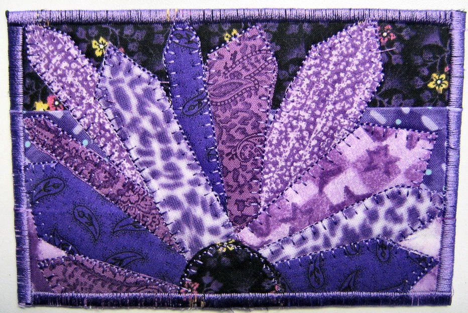
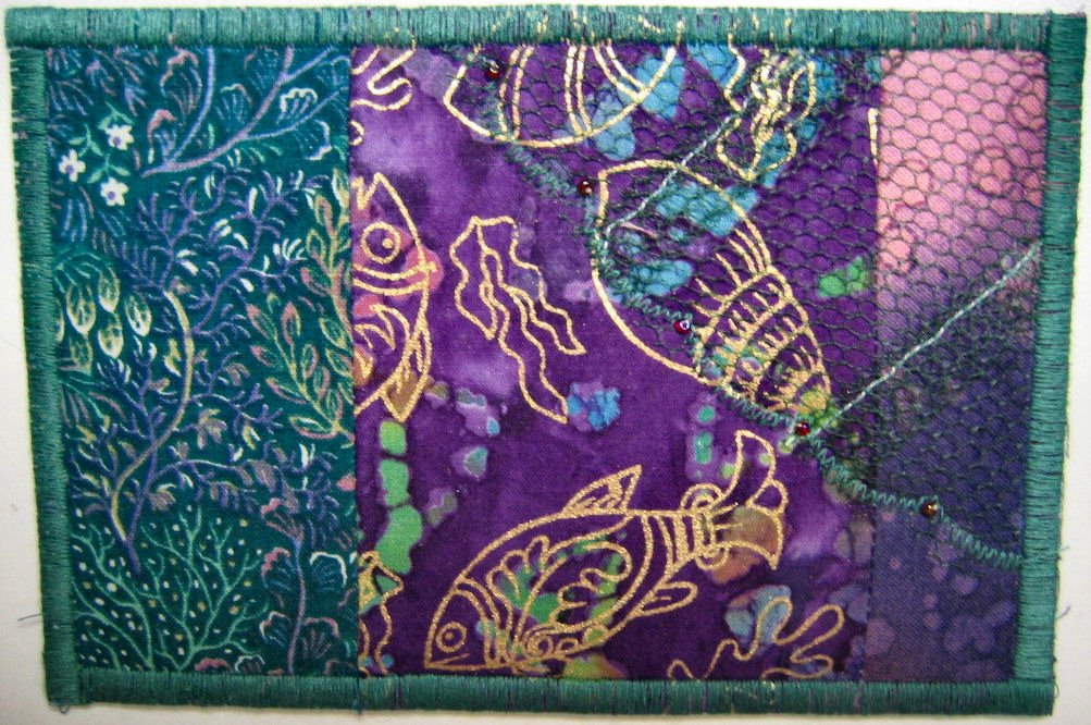 My favorite purples with a fish missing the net. I even added a few red beads to the net edging.
 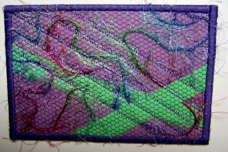 This speaks for itself in it's title -"Gone Wild" The fuzz of the yarn shows off the edge of the card as well. I even took a tiny crochet hook and pulled some of the fuzz looser from under the net.
 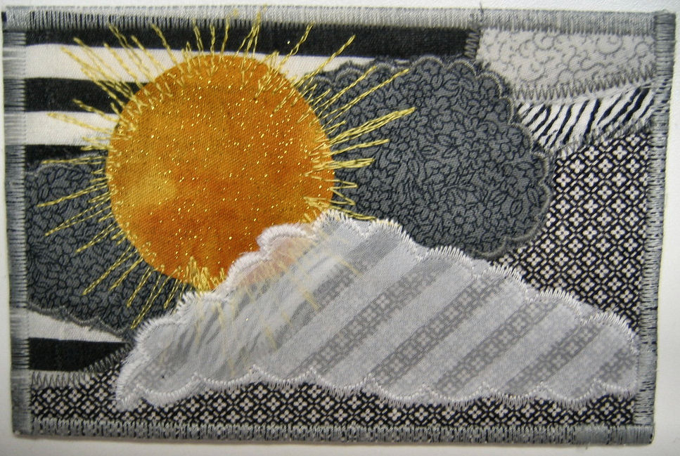 This came out so cool. I loved the shear white material with the striping and couldn't think what to do with it to make the transparency work. One of the other scraps had a cloud-like shape and the bell went off. "Sunshine on a Cloudy Day" was born.